
Thursday, December 1, 2011
Wednesday, November 30, 2011
Feature Article Reading Questions
1) What are some ways to indicate a new paragraph.
A new paragraph begins after an indentation, or tab. A new paragraph can also be shown by leaving a blank line between the two paragraphs. Symbols can be used in denote new paragraphs, as well as text size for either the first word or first sentence of a new paragraph.
2) What are some things to look out for when hyphenating text.
Try to leave at least 2 characters on the line and 3 following, avoid hyphenating proper nouns.
3) Define font hinting. Why is it necessary?
Font hinting is using a rasterized grid to display letter forms that look right to the human eye. At low screen resolutions, hinting is critical for producing a clear, legible text.
4) What is letter spacing/tracking? How do you track in Illustrator or InDesign
Letter spacing is the space between letters and can be called functional white. The white is essential to font legibility and the desired visual impression of the text. The picture illustrates how to track in InDesign or Illustrator.
5) Define Kerning? Name 8 kerning pairs. How do you kern in InDesign or Illustrator?
Kerning is the process of adding or subtracting space between specific pairs of characters. You can automatically kern type using metrics kerning or optical kerning. Metrics kerning uses kern pairs, which are included with most fonts. Kern pairs contain information about the spacing of specific pairs of letters. Some of these are: LA, P., To, Tr, Ta, Tu, Te, Ty, Wa, WA, We, Wo, Ya, and Yo. To kern in Illustrator or InDesign, type or select a numeric value for kerning (looks like A V) in the Character panel.
6)What is word spacing?
Word spacing refers to the size of the space between words.
7) Explain DIN.
Because of a throughout standardisation, normalized DIN A sizes are usually the starting point for paper sizes for printed mater. The sizes of the sheets of paper that are supplied by paper manufacturers are based on these DIN A sizes, with a bit added for trimming, the gripper margin of the printing press and the finish. DIN sizes use a 1: Square Root of 2 ratio. Besides the well-known A sizes, B and C sizes are also used. The B sizes are so-called uncut sizes so the page can be printed with bleed after which the sheet can be cut to a size A. The C sizes are mainly used for envelopes, which can then hold an A size. The American version of the A4 size is 8.5 x 11 inches and is therefore considerable shorter than an A4.
8)What is a baseline grid?
A baseline grid is an imaginary grid upon which type sits. The baseline pf a piece of type can be forced to 'snap' to this grid to maintain continuity across the pages of a design. The grid in Baseline is composed of 4 basic columns, for more flexibility each column can be divided in 2 units.
9) How many characters per line is optimal? Is there a range?
The optimal line length for your body text is usually considered to be within the 50-60 characters per line. At most up to 75 characters is acceptable.
10) Define aesthetic text alignment.
Hanging punctuation controls the alignment of punctuation marks for a specific paragraph. Paragraph alignment determines the margin from which the punctuation hangs.
11)What is a window?
12) What is a typographic river?
A typographic river occurs in justified text blocks when the separation of the words leaves gaps of white space in several lines. A river effect is created where white space gaps align through the text.
13) What is an orphan?
An orphan is the final one or two lines of a paragraph separated from the main paragraph to form a new column and should be avoided at all costs.
A new paragraph begins after an indentation, or tab. A new paragraph can also be shown by leaving a blank line between the two paragraphs. Symbols can be used in denote new paragraphs, as well as text size for either the first word or first sentence of a new paragraph.
2) What are some things to look out for when hyphenating text.
Try to leave at least 2 characters on the line and 3 following, avoid hyphenating proper nouns.
3) Define font hinting. Why is it necessary?
Font hinting is using a rasterized grid to display letter forms that look right to the human eye. At low screen resolutions, hinting is critical for producing a clear, legible text.
4) What is letter spacing/tracking? How do you track in Illustrator or InDesign
Letter spacing is the space between letters and can be called functional white. The white is essential to font legibility and the desired visual impression of the text. The picture illustrates how to track in InDesign or Illustrator.
5) Define Kerning? Name 8 kerning pairs. How do you kern in InDesign or Illustrator?
Kerning is the process of adding or subtracting space between specific pairs of characters. You can automatically kern type using metrics kerning or optical kerning. Metrics kerning uses kern pairs, which are included with most fonts. Kern pairs contain information about the spacing of specific pairs of letters. Some of these are: LA, P., To, Tr, Ta, Tu, Te, Ty, Wa, WA, We, Wo, Ya, and Yo. To kern in Illustrator or InDesign, type or select a numeric value for kerning (looks like A V) in the Character panel.
6)What is word spacing?
Word spacing refers to the size of the space between words.
7) Explain DIN.
Because of a throughout standardisation, normalized DIN A sizes are usually the starting point for paper sizes for printed mater. The sizes of the sheets of paper that are supplied by paper manufacturers are based on these DIN A sizes, with a bit added for trimming, the gripper margin of the printing press and the finish. DIN sizes use a 1: Square Root of 2 ratio. Besides the well-known A sizes, B and C sizes are also used. The B sizes are so-called uncut sizes so the page can be printed with bleed after which the sheet can be cut to a size A. The C sizes are mainly used for envelopes, which can then hold an A size. The American version of the A4 size is 8.5 x 11 inches and is therefore considerable shorter than an A4.
8)What is a baseline grid?
A baseline grid is an imaginary grid upon which type sits. The baseline pf a piece of type can be forced to 'snap' to this grid to maintain continuity across the pages of a design. The grid in Baseline is composed of 4 basic columns, for more flexibility each column can be divided in 2 units.
9) How many characters per line is optimal? Is there a range?
The optimal line length for your body text is usually considered to be within the 50-60 characters per line. At most up to 75 characters is acceptable.
10) Define aesthetic text alignment.
Hanging punctuation controls the alignment of punctuation marks for a specific paragraph. Paragraph alignment determines the margin from which the punctuation hangs.
11)What is a window?
A paragraph-ending line that falls at the beginning of the following page/column, thus separated from the rest of the text.
12) What is a typographic river?
A typographic river occurs in justified text blocks when the separation of the words leaves gaps of white space in several lines. A river effect is created where white space gaps align through the text.
13) What is an orphan?
An orphan is the final one or two lines of a paragraph separated from the main paragraph to form a new column and should be avoided at all costs.
Thursday, November 24, 2011
Type Explorations
Here are a few of my type explorations for VISC 204!
Not sure how I feel about these, any thoughts?


Not sure how I feel about these, any thoughts?


Sunday, November 20, 2011
Vinyl Record Packaging Project
Here is my inspiration for my record packaging for the NASA Gold Record.


Here are my four variations of the front of the album.


Wednesday, November 16, 2011
Graphic Design Referenced
Who is Herb Lubalin?
Designer of first quarterly magazine, Eros, named after the Greek god of love and desire, and devoted to eroticism, love and, sex through history, politics, art and literature. Why was Esguire important?
Because there weren't a lot of magazines out there targeted to men, this magazine combined fiction, sports, humor, poetry, fashion, and other elements of a lush lifestyle targeted at men. Who is Alexy Broadavich?
He freed the pages of Harper's Bazaar to take pleasure in white space and the finely tuned pacing of text and image. He helped revolutionize the notion of magazine design and photography. What did Hoefler-Jones do for Harper"s
They helped introduce an assertive balance of sculptured typography and vibrant photography to create an assertive publication. Who is Gail Anderson?
The art director of the Rolling Stone, who offered some of the most venturesome double-page spreads of the 1990s.Who is David Carson?
The art director for Ray Gun magazine, he had a rule bending design approach give his style a relatively mainstream audience.
Who is Tibor and what is M&Co?
Tibor help develop a multicultural magazine, Colors, that would appeal to the somewhat dissatisfied and politicized younger generation. This magazine would be available in five different bilingual versions.
M&Co is Tibor company that he started with two former designers, from B&N. The work they took on was a breading ground for work blending wit, humor and social consciousness through an approach sinuously shifting between deadpan and expressive.
Who is Neville Brody?
The art director for The Face, he used commercial typefaces and relatively simple layouts but later became more advanced. What is Speak?
A quarterly magazine full of thoughtful writing on culture, loosely covering music, fashion, literature and art.
Photographer Research
David Hilliard-
American photographer born in 1964, went to Yale University an graduated with his MFA in 1994. Hilliard is a fine arts photographer that mainly does panoramic photos and he typically uses people that are close to him as his subjects. The theme of his photos focuses on ordinary life, but all the scenes for his photographs are staged. His photographs are very vibrant in color and they feature large compositions .
Links
http://en.wikipedia.org/wiki/David_Hilliard_(photographer)
http://www.davidhilliard.com/


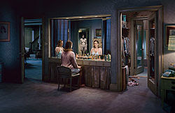
Gregory Crewdson
American photographer born in 1962, best known for the elaborately staged scenes of American homes and neighborhoods. He received his master in fine arts from Yale University and his a professor at Yale University School of the Arts. His photos are very dramatic and cinematic yet they take place in small town America. The lighting and the large crew are key to these impeccably staged photos.

Lee Friedlander
American photographer and artist born in 1934 that typically works with 35mm camera and black and white film. He studied photography at the Art Center College of Design in Pasadena, California. His photos often imitate visual language of urban "social landscape." These photos are often store-front reflections, structures framed by fences, posters and street-signs.
Links:
http://en.wikipedia.org/wiki/Lee_Friedlander
http://www.moma.org/collection/artist.php?artist_id=2002


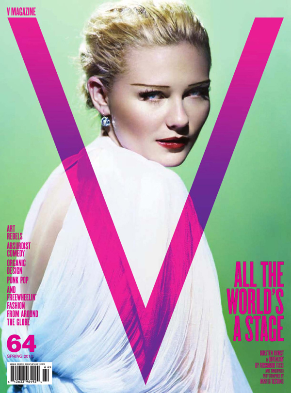
Mario Testino
Peruvian fashion photographer, born 1954 in Lima, he grew up wanting to be a priest but was very flamboyant, leaving him with very few friends. Studied photography in London, and waited tables on the side. He shot fashion stories for Vogue, V, Gucci, and Vanity Fair. He has crafted and contributed to the imagery of leading fashion houses such as Burberry, Gucci, Versace, Calvin Klein, Dolce & Gabbana and more.
Links:


Philip Lorca Dicorcia
American photographer born in 1951, studied at the School of the Museum of Fine Arts, Boston and went on to study at the Yale University where he received his Master of Fine Arts in Photography in 1979. He now is a teacher at Yale and works in New York. His photos are either informal snapshots and iconic quality staged compositions that are very theatrical. His photos are staged to look like real-life situations, but they are beyond the realm of banality. His work can be described as documentary photography, mixed with fictional world of cinema and advertising linking fantasy and desire.
Link:
http://en.wikipedia.org/wiki/Philip-Lorca_diCorcia#Style
http://www.thecollectiveshift.com/show/artist/diCorcia


Terry Richardson
American fashion photographer born 1965, his father Bob Richardson was a fashion photographer. He grew up in Hollywood where he later got connected with Tony Kent, a photographer who hired him as an assistant. His work is often explicit as it contains sexual subject matter. He has worked on major advertisements for fashion designers and editorial photographs. He allegedly sexually abused some of his female models.
Links:
http://en.wikipedia.org/wiki/Terry_Richardson
http://www.terrysdiary.com/


American photographer born in 1964, went to Yale University an graduated with his MFA in 1994. Hilliard is a fine arts photographer that mainly does panoramic photos and he typically uses people that are close to him as his subjects. The theme of his photos focuses on ordinary life, but all the scenes for his photographs are staged. His photographs are very vibrant in color and they feature large compositions .
Links
http://en.wikipedia.org/wiki/David_Hilliard_(photographer)
http://www.davidhilliard.com/


Gregory Crewdson
American photographer born in 1962, best known for the elaborately staged scenes of American homes and neighborhoods. He received his master in fine arts from Yale University and his a professor at Yale University School of the Arts. His photos are very dramatic and cinematic yet they take place in small town America. The lighting and the large crew are key to these impeccably staged photos.
Links:
http://en.wikipedia.org/wiki/Gregory_Crewdson
http://www.aperture.org/crewdson/


Lee Friedlander
American photographer and artist born in 1934 that typically works with 35mm camera and black and white film. He studied photography at the Art Center College of Design in Pasadena, California. His photos often imitate visual language of urban "social landscape." These photos are often store-front reflections, structures framed by fences, posters and street-signs.
Links:
http://en.wikipedia.org/wiki/Lee_Friedlander
http://www.moma.org/collection/artist.php?artist_id=2002


Mario Testino
Peruvian fashion photographer, born 1954 in Lima, he grew up wanting to be a priest but was very flamboyant, leaving him with very few friends. Studied photography in London, and waited tables on the side. He shot fashion stories for Vogue, V, Gucci, and Vanity Fair. He has crafted and contributed to the imagery of leading fashion houses such as Burberry, Gucci, Versace, Calvin Klein, Dolce & Gabbana and more.
Links:
http://en.wikipedia.org/wiki/Mario_Testino
http://www.mariotestino.com/


Philip Lorca Dicorcia
American photographer born in 1951, studied at the School of the Museum of Fine Arts, Boston and went on to study at the Yale University where he received his Master of Fine Arts in Photography in 1979. He now is a teacher at Yale and works in New York. His photos are either informal snapshots and iconic quality staged compositions that are very theatrical. His photos are staged to look like real-life situations, but they are beyond the realm of banality. His work can be described as documentary photography, mixed with fictional world of cinema and advertising linking fantasy and desire.
Link:
http://en.wikipedia.org/wiki/Philip-Lorca_diCorcia#Style
http://www.thecollectiveshift.com/show/artist/diCorcia


Terry Richardson
American fashion photographer born 1965, his father Bob Richardson was a fashion photographer. He grew up in Hollywood where he later got connected with Tony Kent, a photographer who hired him as an assistant. His work is often explicit as it contains sexual subject matter. He has worked on major advertisements for fashion designers and editorial photographs. He allegedly sexually abused some of his female models.
Links:
http://en.wikipedia.org/wiki/Terry_Richardson
http://www.terrysdiary.com/


Thursday, November 10, 2011
Letter Fountain Reading
Small capitals are just smaller versions of capital letters that are specially designed letters. They are slightly bigger than the x-height of lowercase letters and they have matching weight. Small capitals are used in the case where normal capitals would make a section of text too busy. Adobe Garamond has small caps.
Ligatures are specially designed combinations of characters, for example the fi and the fl. These characters traditionally have the problem of crashing into each other because the ascender of the letter "f" would crash into the ascender or the dot of an "i" if it indirectly follows the "f". There are no ligatures in Adobe Garamond.
The font mark is used to indicated feet of a letter and its angled line.
Hyphens are used as a symbol to break up words and these dashes can replace commas.
Thursday, October 27, 2011
Research about Adobe Garamond
The first typographer to refine numeral design was the sixteenth-century French type designer Claude Garamond. Garamond is credited for developing the first set of figures that specifically complemented a font type.
Garamond’s numbers were intended for use in text, and therefore had ascenders and descenders, as well as similar proportions to the lower case letters. This style, known today as text figures are drawn slightly taller than the x-height to avoid confusion between letters and figures of the same shape (such as the zero and the lower case o, for example). Similarly, the descenders of the text figures are usually shorter than those on the letters. In most fonts, the 0, 1 and 2 are medial forms; the 3,4,5,7 and 9 descend, and the 6 and 8 ascend. However, these alignments were not always standard. In the most common variation the 3 and 5 are also ascending figures.
Claude Garamond
Garamond’s historical significance changed when it emerged in the 1920s that the typefaces that had borne his name for some time were, in fact, the result of the work of the French punch cutter and printer Jean Jannon. Garamond’s type is, however, the basis for the roman forms of Linotype Granjon, Berthold Garamond and Robert Slimbach’s Adobe Garamond.
Garamond is credited with developing the sloped capital forms of the italic letterm a genre previously limited to lowercase, and thus creating the conditions for the concept of the companion italic, which is widely attributed to his younger colleague Robert Granjon. Many revivals of Garamond’s roman types partner these with italics based upon those of Granjon.
Claude Garamond (above) was a highly influential type founder, publisher and punchcutter, whose types have been widely copied and are still un use today. His work links Francesco Griffo’s letters cut for Aldus Manutius with the wider development of the Old-Style letter across Europe.
Robert Slimbach 1989, 2004
The types of Claude Garamond have been adapted very freely to successive technologies, and even ‘true Garamonds’ from the 20th century show considerable variations in form and x-height. Garamond was among the first type designers to design companion italic. His letters show fairly low contrast and, as with many letterpress faces, they can look light on the page. Slimbach’s adobe Garamond is a characteristically efficient and pragmatic revival in a genre that has been the subject of misattribution and varied interpretations.
These distinctive old-style design—inspired by the types cut by Francesco Griffo for Aldus Manutius in Venice—were used to print exquisite books now regarded as some of the finest examples of French typography. Garamond and Granjon produced the majority of their work during the 16th century, a time considered by many to be the golden age of French typography. Their designs, now available in digital form, are among the most notable typographic achievements of the era.
These original Garamond letterforms, as well as many other roman types of the 16th century are classified as Garalde or old style. A horizontal bar on the e, bracketed serifs, axis curves that are inclined to the left, and notable contrast between thick and thin strokes are all typical features of this style. Traits particular to Garamond included the small bowl of the a and the small eye of the e, a the downward slope of most stop serifs, and the long extenders. These attributes are fairly consistent among all variations.
When Garamond died in 1561, his punches and matrices were sold to the printer Christopher Plantin, whose independent press was located in Antwerp. Curiously, the types soon appeared on a broadside (Fig. 3) printed by the type foundry Egenolff-Berner. The broadside, which is often used as a reference for contemporary renditions, has several Garamond faces paired with italics designed by Robert Granjon. The specimens printed by this foundry established a high standard in typography, and subsequently Garamond fonts came to influence a huge number of type designs. This font has been expanded to include small caps, titling caps, expert fonts, and swash caps, which were typical in the fifteenth and sixteenth centuries.
In 1989, Adobe introduced Adobe Garamond, whose designer, Robert Slimbach, deftly embraced the beauty of Garamond’s romans and Granjon’s italics. Actually, his decision to combine Granjon and Garamond tupes seems to have been an inevitable marriage. Slimbach reflects that the types “are such beautiful models-canons, really—of mondern letter design. Granjon was the master of French old-style italics. Garamond’s masterpieces were the roman letterforms. They took those forms further than anyone had previously taken tthem, in a sense drawing them to their logical conclusions.
He was compelled to select this particular example because the forms successfully merged a calligraphic quality with the refined roman letter.
Beause Claude Garamond cut punches at diminutive sizes, the letterforms have a sculptural quality and a natural inconsistency. The oragainc aspects of the original types are retained in Slimbach’s refiened letterforms, yet the digital precision of the forms also meets the myriad demands of contemporary useage. Adobe Garamond is an exquisite reinterpretation of its prototype. The extensive family consists of three weights, italics, and an expert collection.
Adobe Garamond’s calligraphic form shines through its increased modularity and contrast in storke weight, unlike Stempel Garamond, which relies heavily on angular forms. The fluid strokes of Adobe Garamond create a soft and harmonious string of characters, while embracing the calligraphic nuances inherent in the original Garamond.
All of the American editions of J. K. Rowling’s Harry Potter books are set in twelve-point Adobe Garamond, except Harry Potter and the Order of the Phoenix, which is set in 11.5-point Adobe Garamond[7][8] because it is longer.
A variation on the Garamond typeface was adopted by Apple in 1984 upon the release of the Macintosh. For branding and marketing the new Macintosh family of products, Apple's designers used the ITC Garamond Light and Book weights and digitally condensed them twenty percent. The result was not as compressed as ITC Garamond Light Condensed or ITC Garamond Book Condensed. Not being a multiple master font, stroke contrast in some characters was too light, and some of the interior counters appeared awkward. To address these problems, Apple commissioned ITC and Bitstream to develop a variant for their proprietary use that was similar in width and feeling, but addressed the digitally condensed version’s shortcomings. Designers at Bitstream produced a unique digital variant, condensed approximately twenty percent, and worked with Apple to make the face more distinct. Following this, Chuck Rowe hinted the TrueTypes. The fonts delivered to Apple were known as Apple Garamond.[9]
Also the Garamond text is used on the 1985 Nintendo's video game consoles in italic form (after the text "Nintendo Entertainment System" or NES) to describe the various version of the consoles.
Typeface Designer (Research)
Claude Garamond (1480–1561)
Garamond began his career apprenticing and working for printers Simone de Colines and Henri Estienne. When Estienne the elder died Garamond worked independently —the first punchcutter to design and produce type faces for sale to other printers. His type designs, while still classified as Old Style, moved further from the characteristics of calligraphy and are categorized in a subdivision of Old Style named Garalde, (Aldus + Garamond). .. According to Alexander Lawson it is generally believed that Garamond based his types upon the work of Griffo.
The type design sold today under the name of Garamond was not his, but the work of Jean Jannon, who modeled his later type design on Garamond's work. ( See item #12)
Robert Slimbach was born in 1956 in Evanston, Illinois, USA.
Shortly after, he arrived in South California where he spent his childhood and his youth.
After leaving college he developed an interest in graphic design and typefaces while running a small screen printshop for manufacturing posters and greeting cards. This work brought him into contact with "Autologic Incorporation" in Newbury Park, CA.
After training from 1983 to 1985, Robert Slimbach worked as a font designer with "Autologic Incorporation", where Sumner Stone also worked for a short time. There he received further training, not just as a font designer but also as a calligrapher.
Robert Slimbach was then self-employed for two years and developed the two fonts "ITC Slimbach®" and "ITC Giovanni®" for the International Typeface Corporation in New York.
In 1987 he joined "Adobe Systems". Ever since, he has been involved in developing new fonts for the Adobe Originals program. His time at "Adobe Systems Incorporation" in Mountain View, CA, has seen the production of the Utopia®, Adobe Garamond™ and Minion® font families by 1991 and Poetica™ by 1992.
In 1991, he received the Charles Peignot Award from the Association Typographique Internationale for excellence in type design. More recently, Slimbach’s own roman script calligraphy formed the basis for his Brioso.
Since 2000, the rate of Slimbach's new typefaces has slowed, as he has taken advantage of the new linguistic and typographic capabilities offered by the OpenType format. Where in the 1990s a given typeface design might be instantiated in one or two fonts, with 200-500 glyphs, a typical new Slimbach work post-2000 has 1500-3000 glyphs.
In 2004, Adobe released Garamond Premier Pro, a new take on the Garamond designs, which Slimbach had been working on for 15 years, since he first completed Adobe Garamond in 1989.
Slimbach has notable skills in several fields other than type design: he went to college on a gymnastics scholarship, and he is an accomplished calligrapher and photographer. His photographic work uses black & white film, and is mainly portraits that examine human foibles and idiosyncrasies.
Sunday, October 23, 2011

Tuesday, October 18, 2011


Wednesday, October 12, 2011
Adobe Garamond
History-
This typeface is named after the punch-cutter Claude Garamond and is considered to be old-style serif. The typeface conveys a sense of fluidity and consistency. The unique characteristics of the typeface is the small bowl on the A and the small eye on the E. The long extenders and top serif have a downward slope. Garamond is one of the most legible serif fonts and is known to be eco-friendly for its ink usage.
Adobe Garamond was based off the traditional Garamond font with a contemporary twist and designed by Adobe type designer, Robert Slimbach in 1989.
Category- Serif
Classification- Old-Style
Designer- Claude Garamond

Sunday, September 18, 2011
Behance Portfolio
Haven't posted in awhile....
This is just a preview of what I have been slaving away at.

Here is a link to my Behance Portfolio where you can check out my work!
http://www.behance.net/clairepedersen/frame
This is just a preview of what I have been slaving away at.

Here is a link to my Behance Portfolio where you can check out my work!
http://www.behance.net/clairepedersen/frame
Monday, September 12, 2011
Font Designers
Living
1) Hans Eduard Meier (b. 1922)
Hans Meier designed the sans-serif typeface called Syntax in 1955. This font relates to the Renaissance humanist and it was used as a cast metal typesetting in the market until 1968.
2. Adrian Frutiger (b. 1928)
Adrian is a french typeface designer who designed numerous typefaces including the most well know, Univers. His other typefaces include, Serifa designed in 1967, Frutiger designed in 1975 and Avenir designed in 1988.
3. Howard Kettler (b. 1918)
Howard is most famous for designing the famous font, Courier in 1955. This font became icon when it was chosen as the font to be printed on a standardized typewritter.
4. Ed Denguiat (b. 1927)
A united states designer who worked at companies like esquire and photo-lettering inc.. In his work he is responsible for producing 600+ typefaces. For example, Souvenir, Tiffany, and Bauhaus.
5. Erik Spiekermann (b. 1947)
First designed the typeface, Meta, and later went on to become the directer of a type company, Fontshop, which he created.
Dead
1) Paul Renner (1878-1956)
Paul was inspired by geometry, which lead him to create the typeface Futura that was created using geometric figures.
2. Claude Garamond (1510-1561)
Claude Garamond is know for cutting Greek type, which Robert Slimback later went on to be use to create the 1989 Adobe Garamond.
3. Bruce Rogers (1870-1957)
In 1914 he created the typeface Centaur, first by hand in ink and then later drawing in italics. He was also known for creating bibliophile books.
4. Stanley Morison (189-1967)
Original creator of the Times New Roman and co-founder of the Fleuron Societ, where he published and edited The Fleuron, a journal of typography.
5. William Caslon (1692-1766)
William Caslon, inspired by the old classic typefaces in the Netherlands, went on to create and name a typeface after himself, Caslon.
(used a Graphic Designed Referenced book)
Thursday, September 8, 2011
30 Minute Type Excersise
This was a 30 minute exercise we had to do for my Visc 202 class. We were given 30 minutes to find text in our surroundings. We used the school news paper and we folded the edges to create the letters.


Visc 202 Questions
Adrian Frutiger:
Adrian is a famous typeface designer from the 20th century, who is responsible for creating the typeface Univers and Frutiger. Univers is a unique type in that it is a tight type family that had different weights of type and were classified by numbers describing this weight. This type has even strokes, large x-height which helps with legibility in both big and small sizes.
Universe Grid:
The Univers grid was introduced along with the typeface in 1957. It represents the different labels for the typeface instead of writing out bold, heavy, light, ect. The numbers refer to the character weight, number 2 represents the thinnest weight the weight increases as the number increases. Number 3 is the widest with 9 being the most condensed. Even numbers mean the typeface is italic and odd numbers mean it is roma.
Example:
Monday, August 29, 2011

Typography Definitions
Weight
Define: density or the lightness of the individual letterforms.
Example: Light vs. Bold text
Width
Define: How wide a letterform becomes from extending or compressing.
Example: Narrow, wide, condensed, extended and normal.
Style
Define: Level of boldness or kind of letter within a typeface.
Example: Light, bold, condensed, italic, small capitals or a series of symbols adapted to suit the particular typeface.
Font
Define: It is a collective name for a typeface but actually referring only to a single style.
Example: Helvetica, Arial, Verdana, Courier, and Georgia.
Typeface
Define: A complete alphabet including letters, numbers punctuation marks, accents, special reference marks etc.
Example: ABCDEFGHIJKLMNOPQRSTUVWXYZ1234567890
X-Height
Define: The height of a lowercase letter 'x'. It is an important feature because it (and letters of a similar height) largely determine the apparent size of a typeface.
Example: x x x x x
Cap Height
Define: Height in millimiters of capital letter in a particular typeface.
Example: P...(height)...ace
Leading
Define: Used more in the days of metal type, the extra white that was added between the lines of the metal type in the form of strips of lead or lead alloy.
Example: (+1) or (+2) depending on the amount of extra points should be added between the lines.
Letter spacing (tracking)
Define: The amount of white spacing between letters.
Example: goat g o a t g o a t
Type is traditionally measured in points.
Measurements
1 inch = 72 points
1 mm = 2.8346567 points
1 picas = 1/2 points
Point
Define: The unit used to measure letterforms.
Pica
Define: The printers unit of measurement that is equal to 12 points.
How many points in an inch?
72 points in 1 inch
If a letter set is 36 points about how many inches tall is it?
1/2 inch tall
How many picas in 1 inch?
6 postscript picas
How many points in a pica?
12 points in 1 pica
Sunday, August 28, 2011
VISC 204: Project 1A
Seahorse
Visual Description
Rough
Boney
Tough
Spiky
Colorful
Neutral
Long Nose
Curly Tail
Pouch
Horns
Small Eyes
Long
Tall
Fins
Snout
Dots
Brown
Yellow
Red
White
Straight
Curly
Straight
Curly
Stripes
Multicolored
Small
Horse
Fish
Scaly
Ribbed
Trunk
Skinny
Rounded Belly
Transparent
Fragile
Dainty
Camouflage
Rigid
Bumpy
Brittle
Monster
Hybrid
Flexible
Dirty
Delicate
Jagged
Sharp
Spiny
Rocky
Uneven
Emotional Description
Tame
Quiet
Reserved
Social
Protective
Shy
Timid
Remote
Private
Gentle
Happy
Calm
Mellow
Partnership
Weak
Willing
Adaptable
Excitable
Determined
Coupled
Silent
Inhibited
Reluctant
Peaceful
Tranquil
Private
Relaxed
Tranquil
Undisturbed
Soothing
Restful
Content
Twosome
Lovable
Friendly
Interested
Natural
Warm
Kindly
Pleasant
Casual
Security
Companion
Protect
Weak
Meek
Feeble
Sound
Whoosh
Quiet
Click
Ambient Noise
Bubble
Silent
Faint
Voiceless
Whispering
Quick
Brief
Swift
Sparse
Hushed
Mute
Soft
Brisk
Rapid
Infrequent
Few
Short
Sudden
Hurried
Other
Cute
Small
Delicate
Sweet
Pokey
Rough
Wet
Scaly
Colorful
Bubbly
Interesting
Unique
Calm
Peaceful
Horse
Curly
Long Nose
Long
Spiky
Ribbed
Flexible
Round
Belly
Sharp
Dainty
Delicate
Top 10 things they never taught me in design school by Michael McDonough
I would like to learn more about what employers look for in portfolios and how to make your portfolio stand out from everyone else's.
Wednesday, August 24, 2011

Questions for Type
_ define the word “grid”
A pattern of regularly spaced horizontal and vertical lines.
_ why do we (designers) use a grid? what are the benefits or functions?
_ why do we (designers) use a grid? what are the benefits or functions?
We use grids to build both complex and austere layouts that enable hierarchy and accessibility through
flexibility and consistency. The grid allows us to use different design elements and have them work in a cohesive manner within a layout.
_ what is a modular grid?
A modular grid has constant horizontal divisions from top to bottom in addition to vertical divisions from left to right.
_ define and illustrate: margins, columns, grid modules. flowlines, gutter
Margins: the space that surrounds the content of a page. It helps divide where the text begins and ends.


Grid Modules: Individual units of space that are separated by regular intervals. They are the basic building blocks of grids. They create columns and rows when repeated.

Flowlines: Horizontal lines that break the space into horizontal bands. They can be used to help guide the eye across the page and can be used to impose starting and stopping points for text and images to be aligned.
Gutter: The inside margins or blank space between two facing pages. It is extra space allowance used to accommodate the binding in books and magazines.

flexibility and consistency. The grid allows us to use different design elements and have them work in a cohesive manner within a layout.
_ what is a modular grid?
A modular grid has constant horizontal divisions from top to bottom in addition to vertical divisions from left to right.
_ define and illustrate: margins, columns, grid modules. flowlines, gutter
Margins: the space that surrounds the content of a page. It helps divide where the text begins and ends.
Columns: Vertical blocks of content positioned on a page, separated by gutters and rules.


Flowlines: Horizontal lines that break the space into horizontal bands. They can be used to help guide the eye across the page and can be used to impose starting and stopping points for text and images to be aligned.
Gutter: The inside margins or blank space between two facing pages. It is extra space allowance used to accommodate the binding in books and magazines.
_ define hierarchy
An arrangement of items in which the items are represented as being "above", "below", or "at the same level as" on another.
_ define typographic color (this does not mean color as in change it to a color)
It is the relative lightness or darkness of a block of text. The shade is dictated by features including font size, the space between letters (kerning), the space between lines (leading), as well as the font selection itself.

_ what are ways to achieve a clear hierarchy?
Through the proper and conscious implementation of visual prompts that emphasize significant content within the design while gradually minimizing the attention needed for the other elements, whether by exaggerating the size of text or image, by isolating a design element, or by employing additional graphics that call attention to specific place in the layout.
_ define white space
The space where no text or no image exist. (negative space)
_ define contrast
Difference in visual properties that makes an object distinguishable from other objects and the background.
Tuesday, August 23, 2011
Typography
In class we had an assignment to create the word MADE with any material we could find in an hour. Allie and I decided we would use edamame from our lunch. We decide to mix up each letter, with some pods closed up, others open, and some beans even sown. I love how this type turned out and I wish I could create a whole alphabet with edamame.


Seahorse
The animal I have chosen for the project is a Seahorse. I picked this animal because every time I go to the zoo and visit the aquarium I find myself intrigued by these amazing fish. Seahorses are found in shallow and tropical environments. They are a boney fish but they don't have scales and their skin is camouflage in color. Theses fish are relatives of the pipe fish. Unlike most animals the males carry the eggs in their pouches until they are fertilized. At that time the sea horses hatch and miniature seahorses are born. Seahorses are not very good swimmers and in stormy seas they often die of exhaustion. The only way they can propel through the water is with their small fin located on their back. They steer with their two pectoral fins near the back of their head. They use their tail to attach to sea grasses and corals and use their snouts to suck plankton and small crustaceans.


A sculpture of a heraldic depicition of a seahorse, by unknown 19th or 18th century French artist, showcased at the National Maritime Museum in Sydney, Australia, photographed by DO'Neil.


Subscribe to:
Comments (Atom)