Wednesday, January 25, 2012
Thursday, December 1, 2011

Wednesday, November 30, 2011
Feature Article Reading Questions
1) What are some ways to indicate a new paragraph.
A new paragraph begins after an indentation, or tab. A new paragraph can also be shown by leaving a blank line between the two paragraphs. Symbols can be used in denote new paragraphs, as well as text size for either the first word or first sentence of a new paragraph.
2) What are some things to look out for when hyphenating text.
Try to leave at least 2 characters on the line and 3 following, avoid hyphenating proper nouns.
3) Define font hinting. Why is it necessary?
Font hinting is using a rasterized grid to display letter forms that look right to the human eye. At low screen resolutions, hinting is critical for producing a clear, legible text.
4) What is letter spacing/tracking? How do you track in Illustrator or InDesign
Letter spacing is the space between letters and can be called functional white. The white is essential to font legibility and the desired visual impression of the text. The picture illustrates how to track in InDesign or Illustrator.
5) Define Kerning? Name 8 kerning pairs. How do you kern in InDesign or Illustrator?
Kerning is the process of adding or subtracting space between specific pairs of characters. You can automatically kern type using metrics kerning or optical kerning. Metrics kerning uses kern pairs, which are included with most fonts. Kern pairs contain information about the spacing of specific pairs of letters. Some of these are: LA, P., To, Tr, Ta, Tu, Te, Ty, Wa, WA, We, Wo, Ya, and Yo. To kern in Illustrator or InDesign, type or select a numeric value for kerning (looks like A V) in the Character panel.
6)What is word spacing?
Word spacing refers to the size of the space between words.
7) Explain DIN.
Because of a throughout standardisation, normalized DIN A sizes are usually the starting point for paper sizes for printed mater. The sizes of the sheets of paper that are supplied by paper manufacturers are based on these DIN A sizes, with a bit added for trimming, the gripper margin of the printing press and the finish. DIN sizes use a 1: Square Root of 2 ratio. Besides the well-known A sizes, B and C sizes are also used. The B sizes are so-called uncut sizes so the page can be printed with bleed after which the sheet can be cut to a size A. The C sizes are mainly used for envelopes, which can then hold an A size. The American version of the A4 size is 8.5 x 11 inches and is therefore considerable shorter than an A4.
8)What is a baseline grid?
A baseline grid is an imaginary grid upon which type sits. The baseline pf a piece of type can be forced to 'snap' to this grid to maintain continuity across the pages of a design. The grid in Baseline is composed of 4 basic columns, for more flexibility each column can be divided in 2 units.
9) How many characters per line is optimal? Is there a range?
The optimal line length for your body text is usually considered to be within the 50-60 characters per line. At most up to 75 characters is acceptable.
10) Define aesthetic text alignment.
Hanging punctuation controls the alignment of punctuation marks for a specific paragraph. Paragraph alignment determines the margin from which the punctuation hangs.
11)What is a window?
12) What is a typographic river?
A typographic river occurs in justified text blocks when the separation of the words leaves gaps of white space in several lines. A river effect is created where white space gaps align through the text.
13) What is an orphan?
An orphan is the final one or two lines of a paragraph separated from the main paragraph to form a new column and should be avoided at all costs.
A new paragraph begins after an indentation, or tab. A new paragraph can also be shown by leaving a blank line between the two paragraphs. Symbols can be used in denote new paragraphs, as well as text size for either the first word or first sentence of a new paragraph.
2) What are some things to look out for when hyphenating text.
Try to leave at least 2 characters on the line and 3 following, avoid hyphenating proper nouns.
3) Define font hinting. Why is it necessary?
Font hinting is using a rasterized grid to display letter forms that look right to the human eye. At low screen resolutions, hinting is critical for producing a clear, legible text.
4) What is letter spacing/tracking? How do you track in Illustrator or InDesign
Letter spacing is the space between letters and can be called functional white. The white is essential to font legibility and the desired visual impression of the text. The picture illustrates how to track in InDesign or Illustrator.
5) Define Kerning? Name 8 kerning pairs. How do you kern in InDesign or Illustrator?
Kerning is the process of adding or subtracting space between specific pairs of characters. You can automatically kern type using metrics kerning or optical kerning. Metrics kerning uses kern pairs, which are included with most fonts. Kern pairs contain information about the spacing of specific pairs of letters. Some of these are: LA, P., To, Tr, Ta, Tu, Te, Ty, Wa, WA, We, Wo, Ya, and Yo. To kern in Illustrator or InDesign, type or select a numeric value for kerning (looks like A V) in the Character panel.
6)What is word spacing?
Word spacing refers to the size of the space between words.
7) Explain DIN.
Because of a throughout standardisation, normalized DIN A sizes are usually the starting point for paper sizes for printed mater. The sizes of the sheets of paper that are supplied by paper manufacturers are based on these DIN A sizes, with a bit added for trimming, the gripper margin of the printing press and the finish. DIN sizes use a 1: Square Root of 2 ratio. Besides the well-known A sizes, B and C sizes are also used. The B sizes are so-called uncut sizes so the page can be printed with bleed after which the sheet can be cut to a size A. The C sizes are mainly used for envelopes, which can then hold an A size. The American version of the A4 size is 8.5 x 11 inches and is therefore considerable shorter than an A4.
8)What is a baseline grid?
A baseline grid is an imaginary grid upon which type sits. The baseline pf a piece of type can be forced to 'snap' to this grid to maintain continuity across the pages of a design. The grid in Baseline is composed of 4 basic columns, for more flexibility each column can be divided in 2 units.
9) How many characters per line is optimal? Is there a range?
The optimal line length for your body text is usually considered to be within the 50-60 characters per line. At most up to 75 characters is acceptable.
10) Define aesthetic text alignment.
Hanging punctuation controls the alignment of punctuation marks for a specific paragraph. Paragraph alignment determines the margin from which the punctuation hangs.
11)What is a window?
A paragraph-ending line that falls at the beginning of the following page/column, thus separated from the rest of the text.
12) What is a typographic river?
A typographic river occurs in justified text blocks when the separation of the words leaves gaps of white space in several lines. A river effect is created where white space gaps align through the text.
13) What is an orphan?
An orphan is the final one or two lines of a paragraph separated from the main paragraph to form a new column and should be avoided at all costs.
Thursday, November 24, 2011
Type Explorations
Here are a few of my type explorations for VISC 204!
Not sure how I feel about these, any thoughts?


Not sure how I feel about these, any thoughts?


Sunday, November 20, 2011
Vinyl Record Packaging Project
Here is my inspiration for my record packaging for the NASA Gold Record.


Here are my four variations of the front of the album.


Wednesday, November 16, 2011
Graphic Design Referenced
Who is Herb Lubalin?
Designer of first quarterly magazine, Eros, named after the Greek god of love and desire, and devoted to eroticism, love and, sex through history, politics, art and literature. Why was Esguire important?
Because there weren't a lot of magazines out there targeted to men, this magazine combined fiction, sports, humor, poetry, fashion, and other elements of a lush lifestyle targeted at men. Who is Alexy Broadavich?
He freed the pages of Harper's Bazaar to take pleasure in white space and the finely tuned pacing of text and image. He helped revolutionize the notion of magazine design and photography. What did Hoefler-Jones do for Harper"s
They helped introduce an assertive balance of sculptured typography and vibrant photography to create an assertive publication. Who is Gail Anderson?
The art director of the Rolling Stone, who offered some of the most venturesome double-page spreads of the 1990s.Who is David Carson?
The art director for Ray Gun magazine, he had a rule bending design approach give his style a relatively mainstream audience.
Who is Tibor and what is M&Co?
Tibor help develop a multicultural magazine, Colors, that would appeal to the somewhat dissatisfied and politicized younger generation. This magazine would be available in five different bilingual versions.
M&Co is Tibor company that he started with two former designers, from B&N. The work they took on was a breading ground for work blending wit, humor and social consciousness through an approach sinuously shifting between deadpan and expressive.
Who is Neville Brody?
The art director for The Face, he used commercial typefaces and relatively simple layouts but later became more advanced. What is Speak?
A quarterly magazine full of thoughtful writing on culture, loosely covering music, fashion, literature and art.
Photographer Research
David Hilliard-
American photographer born in 1964, went to Yale University an graduated with his MFA in 1994. Hilliard is a fine arts photographer that mainly does panoramic photos and he typically uses people that are close to him as his subjects. The theme of his photos focuses on ordinary life, but all the scenes for his photographs are staged. His photographs are very vibrant in color and they feature large compositions .
Links
http://en.wikipedia.org/wiki/David_Hilliard_(photographer)
http://www.davidhilliard.com/


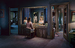
Gregory Crewdson
American photographer born in 1962, best known for the elaborately staged scenes of American homes and neighborhoods. He received his master in fine arts from Yale University and his a professor at Yale University School of the Arts. His photos are very dramatic and cinematic yet they take place in small town America. The lighting and the large crew are key to these impeccably staged photos.

Lee Friedlander
American photographer and artist born in 1934 that typically works with 35mm camera and black and white film. He studied photography at the Art Center College of Design in Pasadena, California. His photos often imitate visual language of urban "social landscape." These photos are often store-front reflections, structures framed by fences, posters and street-signs.
Links:
http://en.wikipedia.org/wiki/Lee_Friedlander
http://www.moma.org/collection/artist.php?artist_id=2002


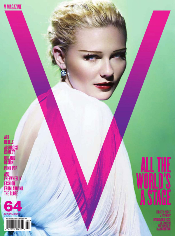
Mario Testino
Peruvian fashion photographer, born 1954 in Lima, he grew up wanting to be a priest but was very flamboyant, leaving him with very few friends. Studied photography in London, and waited tables on the side. He shot fashion stories for Vogue, V, Gucci, and Vanity Fair. He has crafted and contributed to the imagery of leading fashion houses such as Burberry, Gucci, Versace, Calvin Klein, Dolce & Gabbana and more.
Links:


Philip Lorca Dicorcia
American photographer born in 1951, studied at the School of the Museum of Fine Arts, Boston and went on to study at the Yale University where he received his Master of Fine Arts in Photography in 1979. He now is a teacher at Yale and works in New York. His photos are either informal snapshots and iconic quality staged compositions that are very theatrical. His photos are staged to look like real-life situations, but they are beyond the realm of banality. His work can be described as documentary photography, mixed with fictional world of cinema and advertising linking fantasy and desire.
Link:
http://en.wikipedia.org/wiki/Philip-Lorca_diCorcia#Style
http://www.thecollectiveshift.com/show/artist/diCorcia


Terry Richardson
American fashion photographer born 1965, his father Bob Richardson was a fashion photographer. He grew up in Hollywood where he later got connected with Tony Kent, a photographer who hired him as an assistant. His work is often explicit as it contains sexual subject matter. He has worked on major advertisements for fashion designers and editorial photographs. He allegedly sexually abused some of his female models.
Links:
http://en.wikipedia.org/wiki/Terry_Richardson
http://www.terrysdiary.com/


American photographer born in 1964, went to Yale University an graduated with his MFA in 1994. Hilliard is a fine arts photographer that mainly does panoramic photos and he typically uses people that are close to him as his subjects. The theme of his photos focuses on ordinary life, but all the scenes for his photographs are staged. His photographs are very vibrant in color and they feature large compositions .
Links
http://en.wikipedia.org/wiki/David_Hilliard_(photographer)
http://www.davidhilliard.com/


Gregory Crewdson
American photographer born in 1962, best known for the elaborately staged scenes of American homes and neighborhoods. He received his master in fine arts from Yale University and his a professor at Yale University School of the Arts. His photos are very dramatic and cinematic yet they take place in small town America. The lighting and the large crew are key to these impeccably staged photos.
Links:
http://en.wikipedia.org/wiki/Gregory_Crewdson
http://www.aperture.org/crewdson/


Lee Friedlander
American photographer and artist born in 1934 that typically works with 35mm camera and black and white film. He studied photography at the Art Center College of Design in Pasadena, California. His photos often imitate visual language of urban "social landscape." These photos are often store-front reflections, structures framed by fences, posters and street-signs.
Links:
http://en.wikipedia.org/wiki/Lee_Friedlander
http://www.moma.org/collection/artist.php?artist_id=2002


Mario Testino
Peruvian fashion photographer, born 1954 in Lima, he grew up wanting to be a priest but was very flamboyant, leaving him with very few friends. Studied photography in London, and waited tables on the side. He shot fashion stories for Vogue, V, Gucci, and Vanity Fair. He has crafted and contributed to the imagery of leading fashion houses such as Burberry, Gucci, Versace, Calvin Klein, Dolce & Gabbana and more.
Links:
http://en.wikipedia.org/wiki/Mario_Testino
http://www.mariotestino.com/


Philip Lorca Dicorcia
American photographer born in 1951, studied at the School of the Museum of Fine Arts, Boston and went on to study at the Yale University where he received his Master of Fine Arts in Photography in 1979. He now is a teacher at Yale and works in New York. His photos are either informal snapshots and iconic quality staged compositions that are very theatrical. His photos are staged to look like real-life situations, but they are beyond the realm of banality. His work can be described as documentary photography, mixed with fictional world of cinema and advertising linking fantasy and desire.
Link:
http://en.wikipedia.org/wiki/Philip-Lorca_diCorcia#Style
http://www.thecollectiveshift.com/show/artist/diCorcia


Terry Richardson
American fashion photographer born 1965, his father Bob Richardson was a fashion photographer. He grew up in Hollywood where he later got connected with Tony Kent, a photographer who hired him as an assistant. His work is often explicit as it contains sexual subject matter. He has worked on major advertisements for fashion designers and editorial photographs. He allegedly sexually abused some of his female models.
Links:
http://en.wikipedia.org/wiki/Terry_Richardson
http://www.terrysdiary.com/


Subscribe to:
Posts (Atom)